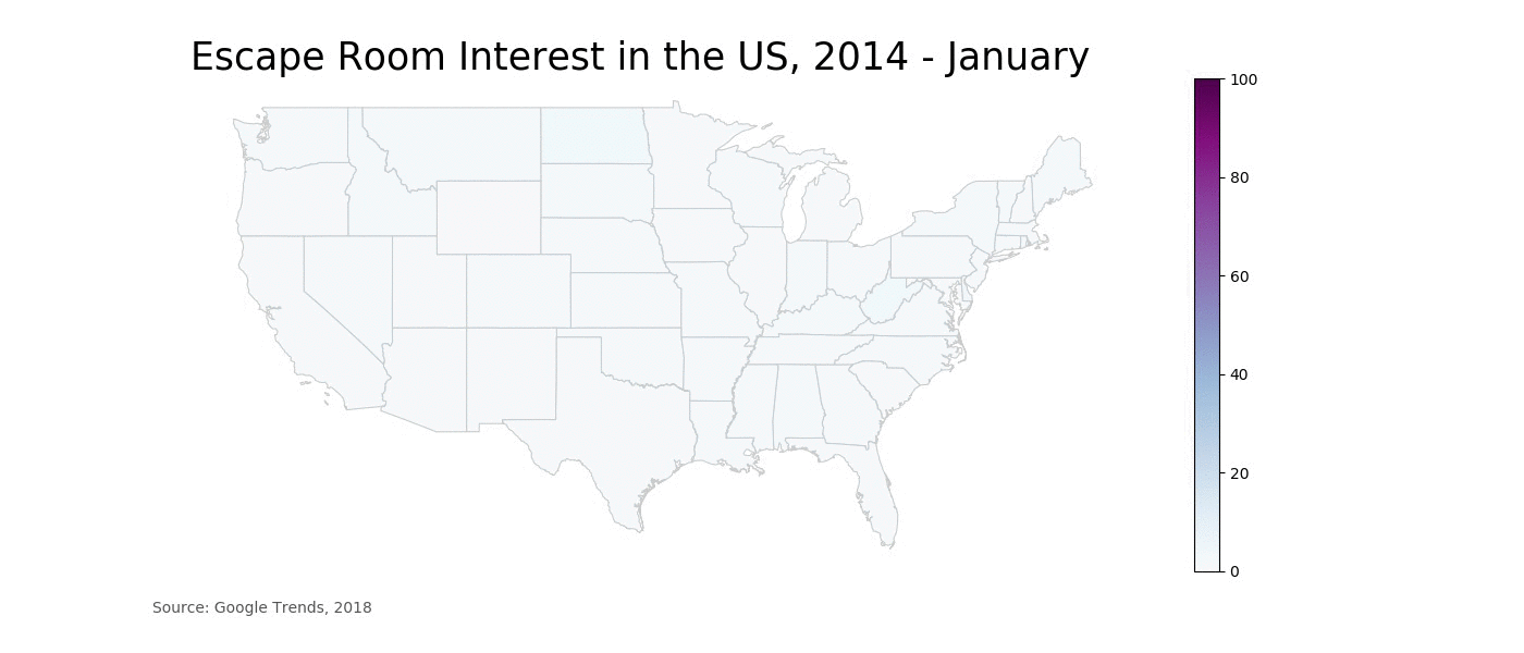
As Updraft Ventures was winding down, I became interested in how the escape room industry was doing more broadly, and could not find the information I was looking for in an easy to use format. This sparked a broader interest in animated choropleth maps.
As with many data visualization projects, most of the difficulty was in wrangling the data into the right format. I used Pandas, the Python table manipulation library, to manage this task.
The Jupyter Notebooks for my choropleth maps can be found on my Github.
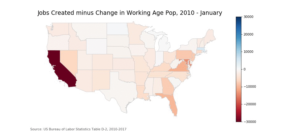
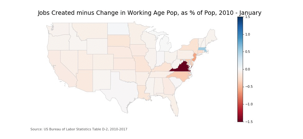
The metric I chose is total change in non-farm employed persons minus the change in working age population. This gets around the downsides of using unemployment as a metric. I produced choropleths using both absolute change, and change as a percentage of population. Absolute change is more useful for visualizing "where jobs are going", while percentage change is more useful for visualizing how the people in those states perceive the change.
See the Github