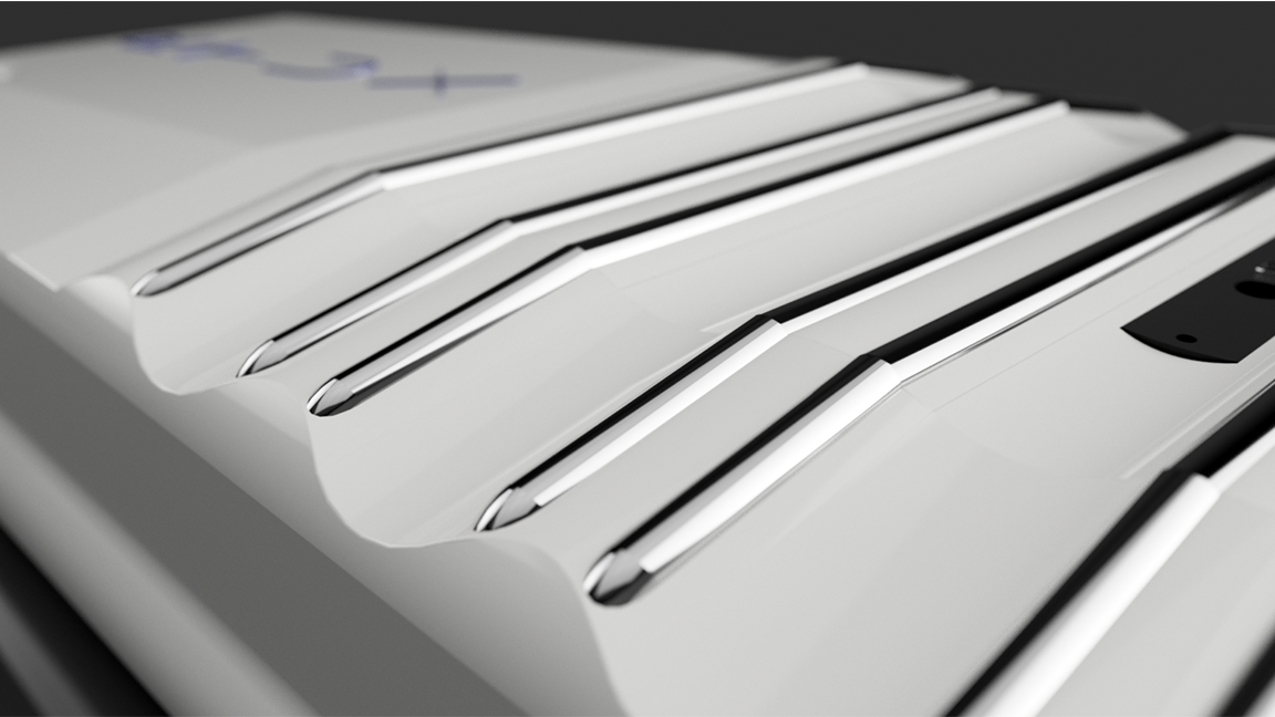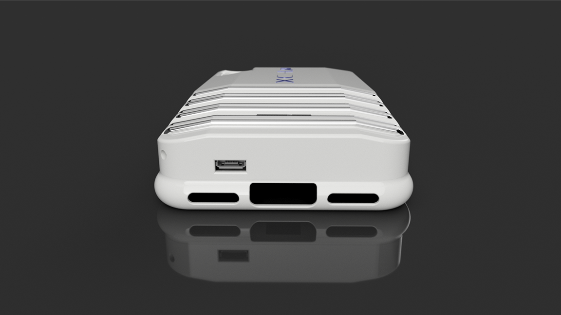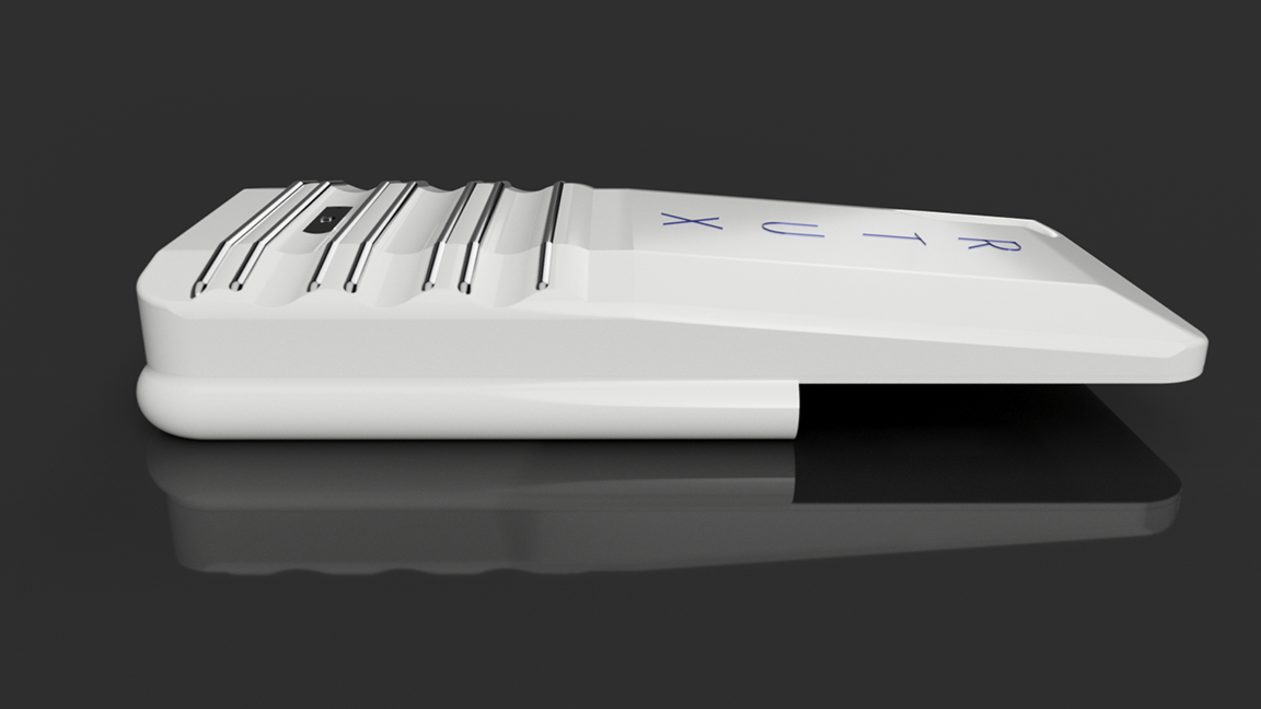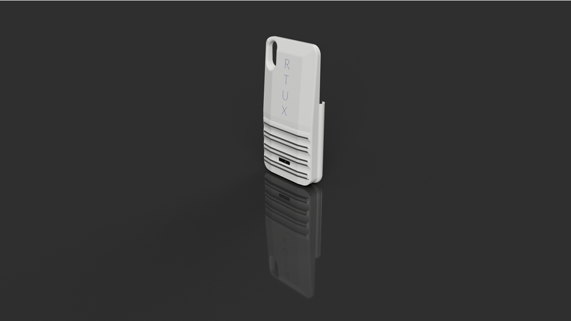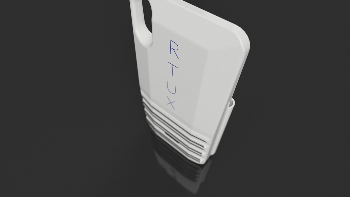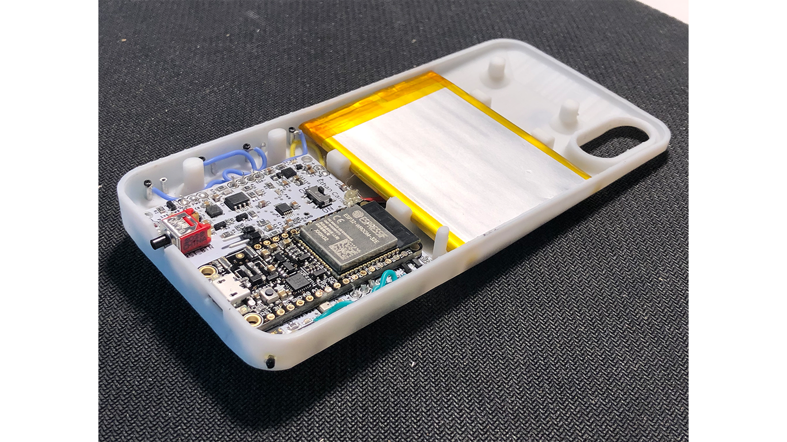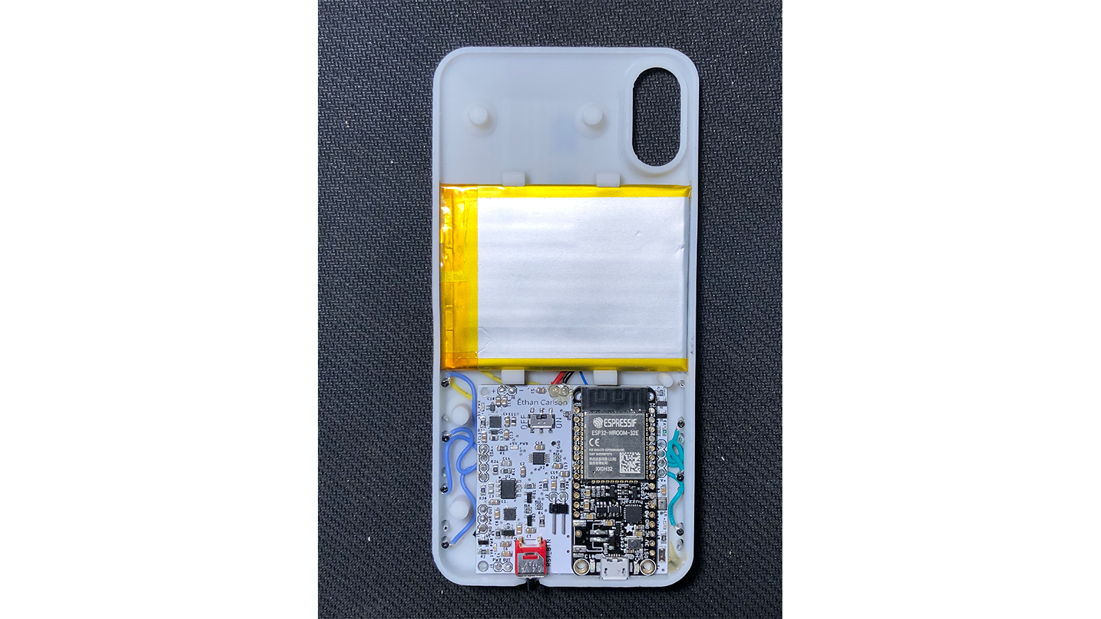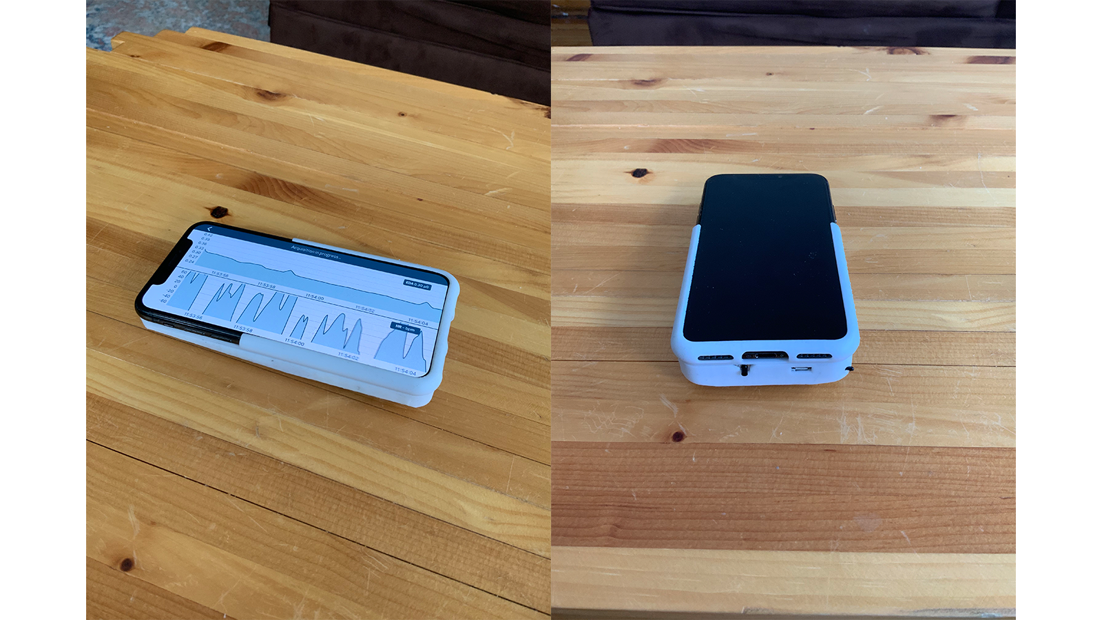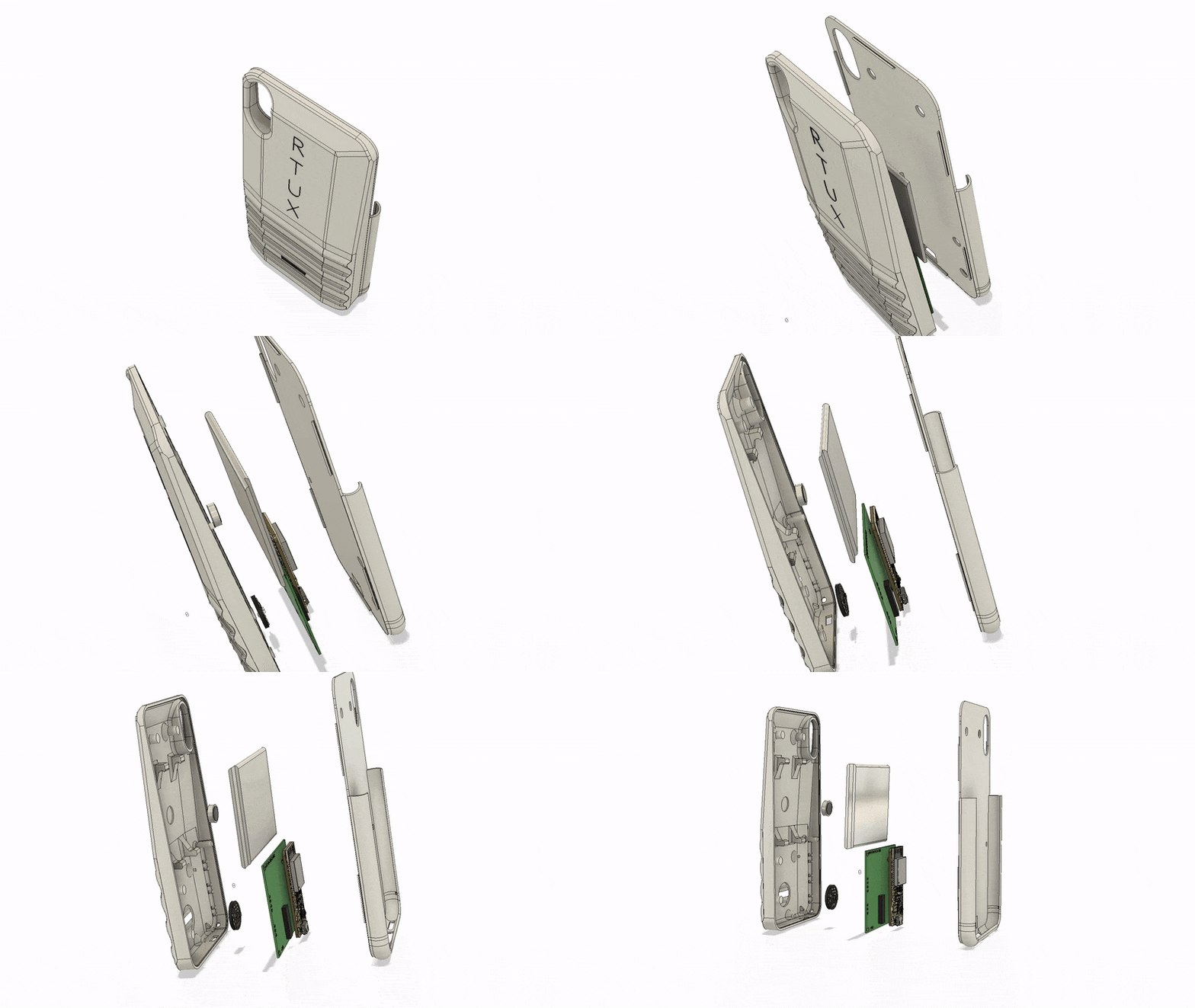
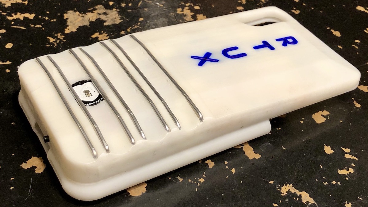
Real Time UX ("Real Time User Experience") is a phone case that is capable of sensing when the person using the phone is stressed or frustrated, as a way of automatically generating usability feedback. It is a project that I developed as part of my Master's Thesis at MIT.


I attempt to leverage this knowledge in order to improve the usability of mobile apps in real time and make development cycles shorter and more effective.
Much research has been done on the changes that take place in the hands when a subject's emotional state changes. Hands have the highest density of eccrine sweat glands, which are the best way to sense sympathetic nervous system (SNS) activity. SNS activity is associated with our "fight or flight" response, and is a reliable measure of stress. Hands are also a convenient place to measure heart rate and heart rate variability, signals mediated by both SNS and PNS activity. We also emote with our hands directly - squeezing, gesturing, and shaking them to consciously or subconsciously express ourselves. All of these signals together can be used to build a model of the user's frustration, stress, and engagement with a mobile app experience.
Real Time Data Charts Github Code RepoThe origins of the project came directly out of my previous work on Allay. I wanted to create an affective agent within the pill box that could sense the user's basic emotional state and use behavioral science nudges to help drive healthy behavior change. In working through what that would mean, I realized that the core idea within that project - sensing and operationalizing user emotional state - was where my interest lay.
This project was a hybrid between engineering research and product design, and therefore followed a slightly unconventional trajectory. I had to balance, and sometimes alternate between, figuring out what was technically possible and what would be desirable for end users. I therefore started by doing a series of open-ended interviews to lay the groundwork for how usability feedback happened currently, and then set out to make sure that I understood what kind of product experience I would actually be able to deliver.
Not having any background in psychophysiology, I had to perform an extensive literature review of prior work done in the field. My review concentrated on two areas that I needed to understand. The first was on what other people had accomplished in trying to use physiology to measure user experience and usability. While not a mature field, I was able to find a variety of attempts to use electrodermal activity and heart rate as a measure of frustration. None of them had been built into a mobile, field operational device, so this research both validated that the technology was likely to function and confirmed that I would be adding something to the field.
The second area of research was into specific methods of measuring user physiology, as well as best practices for determining the metrics that would form the inputs into my machine learning model. Electrodermal activity and cardiac activity have both been studied deeply for over a century, and I was able to find current and readable reviews of the best methods as well as open source tools to assist in feature extraction and analysis, such as EDA Explorer.
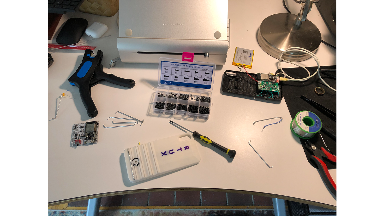
With my domain knowledge and literature review in hand, I was ready to start building things. I first built a breadboard prototype to validate the basic performance of the subcircuits I had spec'd before going through the time and expense of creating my first printed circuit board. The initial prototype ran on an Arduino Micro that I had lying around and reported values through a USB cable.
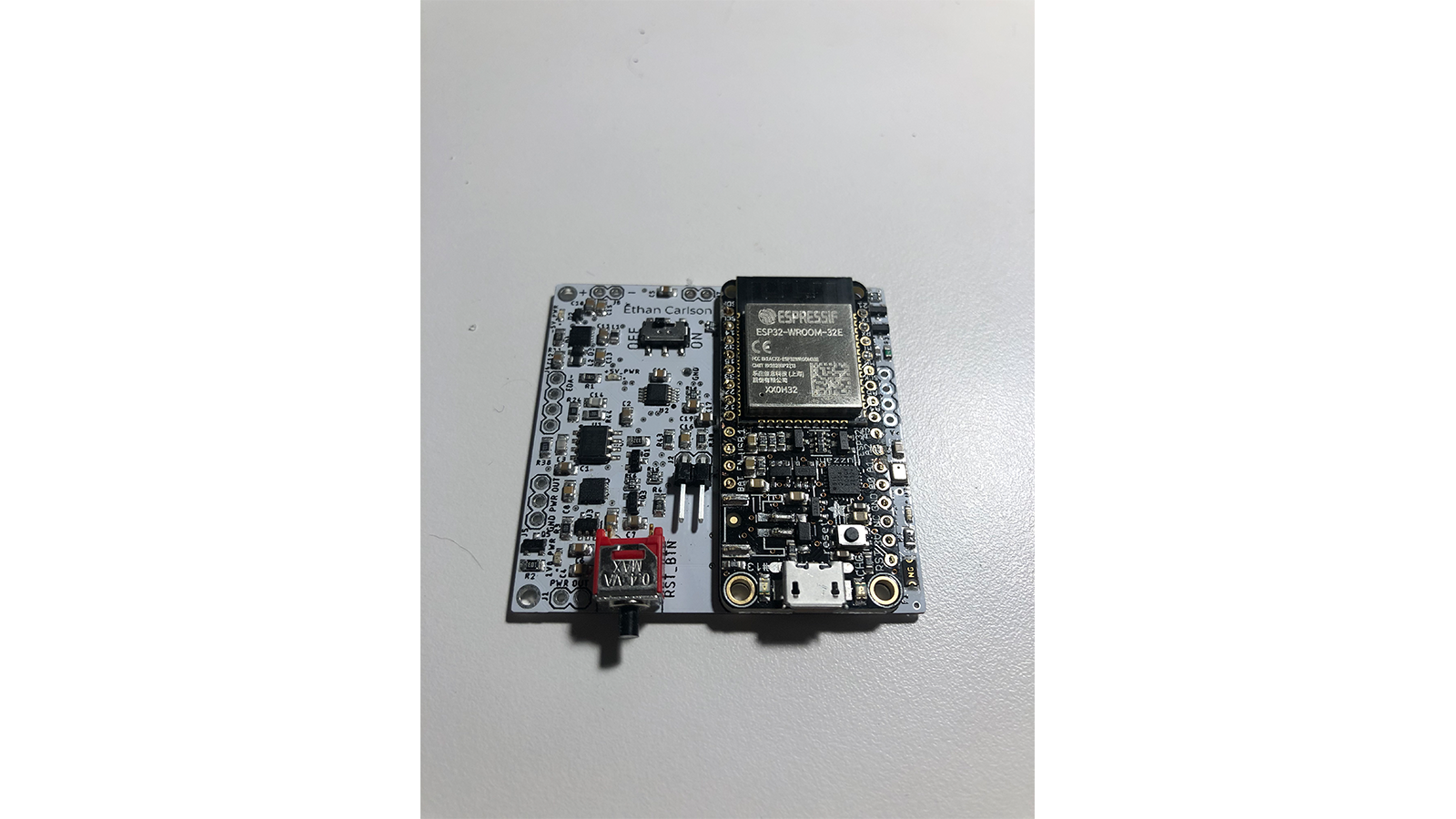
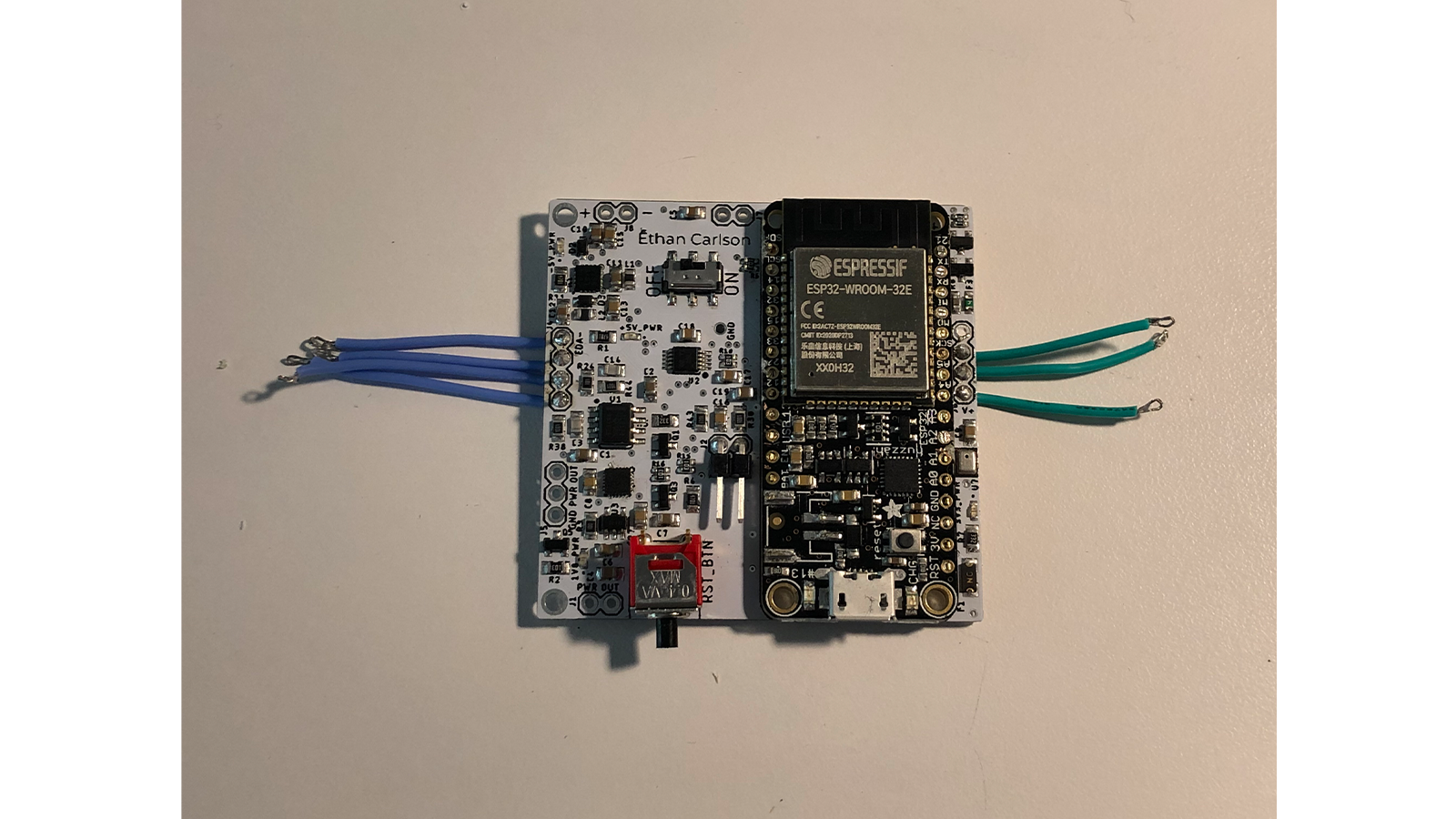
Following this success, I wanted to quickly move to a PCB. Operating in the form factor of a phone case, size constraints were a priority for me and I needed to make sure that everything would fit and I wouldn't run into any issues with data collection. I built the second and third prototypes on the Particle Argon development platform, in order to save myself as much time as possible in reporting data to the cloud. I also started creating 3D printed enclosures to test the ergonomics and physical user interfaces of the case. The early iterations were mostly frames for the electrodes to mount to.
Unfortunately, the Particle infrastructure was too limiting for the amount of data that I needed to send and the frequency with which I needed to do it. I therefore switched to the HUZZAH32, which is an ESP32-based development board from Adafruit and shares the same footprint as the Particle Argon. The fourth through sixth and final revisions focused on signal fidelity, miniaturization, mechanical constraints, and aesthetics. On the mechanical side, I began to optimize the enclosure for ergonomics, ease of assembly, and finally aesthetics.
Around the third iteration of prototyping, I had gained confidence in the type of product I would be able to build and therefore decided to go back and finish my user research. I interviewed approximately 20 product managers and UI/UX designers to learn the tools they currently used to determine app usability, the flaws they saw in these tools, and how they would think about purchasing a new tool to solve these problems. At the end of each interview I showed them the device that I was working on and got their feedback on how feasible it would be to integrate with their workflow.
While I got a lot of excitement and encouragement from users, I also perceived that there was a relatively low willingness to pay for a new solution. Most product teams operate on shoestring budgets and are seen as a cost center by their organizations. Therefore I determined that this product, while useful, would likely see limited success in the market.
As a minimum viable model of user affect, I used a rule based system to translate tonic skin conductance and heart rate variability into a measure of stress. This method is based on prior work in the field and has the advantages of being easy to code, interpret, and adjust. However, it also has a slow reaction time, is unable to isolate specific frustrating events, and needs to be hand calibrated to each user.
Conventionally in the field, a Hidden Markov Model has been used to model user affect, where latent emotional states are hypothesized to generate observable data. This option has the benefit of a wide body of historical work and are relatively straightforward to train. However, HMMs are nearly stateless; they lack the deep historical context and the large number of training parameters of more modern models like LSTMs (Long-Short Term Memory models). An LSTM model is the most likely to be robust and resilient throughout time as well as different users, and it is the easiest to personalize to a given user's physiology.
Both HMMs and LSTMs have the same problem, though LSTMs have it worse, which is the difficulty in collecting labeled frustration data. A human subjects trial would have been the way to gather training data, but unfortunately was out of scope for this project. Instead the model is trained on my own use in a variety of contexts. Even so, the data is likely polluted by my own expectations for what is frustrating and what isn't.
The final model architecture was a pre-trained LSTM that then undergoes transfer learning on the first five minutes of usage in order to adjust for the context of that specific use case. This effectively adjusts for many of the per-instance and per-user variables. However, it comes with the downside that arousal tends to go down over the course of a usage session as a user settles in. The result is that the model can effectively determine arousal peaks and adjust when it is most important to do so, but it is noisy at lower arousal levels.
In the final few weeks of the project, I had seven other people play Pepper the Chicken on RTUX and give usability feedback as well as feedback on the automated difficulty adjustment feature. The overarching theme was that the automated difficulty setting was robust enough to bring value to users, and they found the novelty very interesting. The experience suffered from overall usability issues, however, as the device does not allow for a wide variety of hand grips and some users found it uncomfortable to hold the device such that it could always maintain a pulse reading. These issues could very likely be resolved in future revisions.
Furthermore, all participants were highly aware of the actions of the model in the background. In the context of user testing this is to be expected. However, it does not simulate the real world conditions where users are not as technically minded and perhaps not as patient with the device's choices.
"Human-centered design is, at its core, the process of making the world a better place by improving the experience of all stakeholders. Improving app usability may seem to be a marginal increase in value, providing some gain in efficiency, effectiveness, or entertainment, or in reducing the amount of stress and frustration experienced by app users. As mentioned earlier in the paper, the value of this goal should not be underestimated in all contexts. However, sometimes usability has a greater ethical imperative. RTUX can help flag accessibility problems, or designs that are culturally insensitive. Such issues virtually never arise out of malice or callousness on the part of the app designer, but rather a lack of empathy. RTUX is one small step to try to create pathways for empathy to flow through our technology more easily."
