Allay

Allay is an IoT device and platform for seniors and their caretakers that helps make managing their medication easier and less stressful. I worked on this project in context of the IDM core curriculum with three other people. I served as the technical lead.

  • Product Design
  • MITidm
  • Consumer Healthcare
  • Internet of Things
  • Design Challenge
  • There are already many products on the market that are designed to help improve medication adherence, but few of them keep the needs of the most important stakeholder, the user, at the center of the design. We wanted to create something that seniors would actually enjoy having in their home. The thesis was that if we solved for usability and comfort, then improvement in health outcomes would follow.
  • Project Scope
  • We took this project from inception through extensive design research, several rounds of ideation and concept prototyping, product detail design, and business model design. Halfway through the project we were hit by a global pandemic and lost physical access to our users and prototyping equipment, therefore our later prototypes and feedback sessions took place digitally.
Properly managed medication can improve patient outcomes, reduce costs, and relieve stress from users and caretakers.

After interviewing many elderly users, it became obvious that medication management is both a huge source of stress for many elderly people and their caretakers, but current solutions are failing to meet user needs. Allay is meant to be a luxury pill box and medication management device that looks less like a medical device and more like furniture, gives control back to the patient, and has a user experience designed with seniors in mind.

See the Prototype Interface See the Final Presentation
  • Target User65-85 years old, living independently
  • StakeholdersUsers, Caretakers, Healthcare Providers, Insurance, ACO's, Medicare
  • Price$89 + $10/month
  • Design TeamEthan Carlson (Engineer), Nani Kim (Designer), Jordan Gowan (Designer), John Liu (Business)
Design Process

One of the unique things about designing in the context of graduate school is that we had the freedom to work on pretty much whatever we wanted. Therefore, the project began with a process of determining what kinds of issues we were excited to work on.

Candidate problem areas included weight loss for health, transitioning from working life to retirement, creating community in retirement, and making the design process more accessible to non-designers.

Once we decided that we wanted to work with seniors, we began interviewing our users first on the phone, and then in-person to hear and observe their needs. In this process we discovered that medication management, while a popular opportunity space for designers, remained a large and unsolved problem for our users.

The output of this step was a loosely ranked list of user needs in the medication management space, the final version of which you can see below.

We then started the iterative process of translating user needs into product features. We first considered feature concepts in isolation and ranked them based on desirability, feasibility, and business viability. This is not a deterministic process; attractive features and aspects of features were combined with other concepts or kept in reserve for later iterations. Further iteration was required when it came time to combine product features into a series of cohesive prototypes.

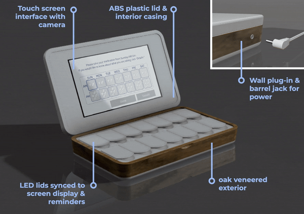
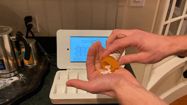
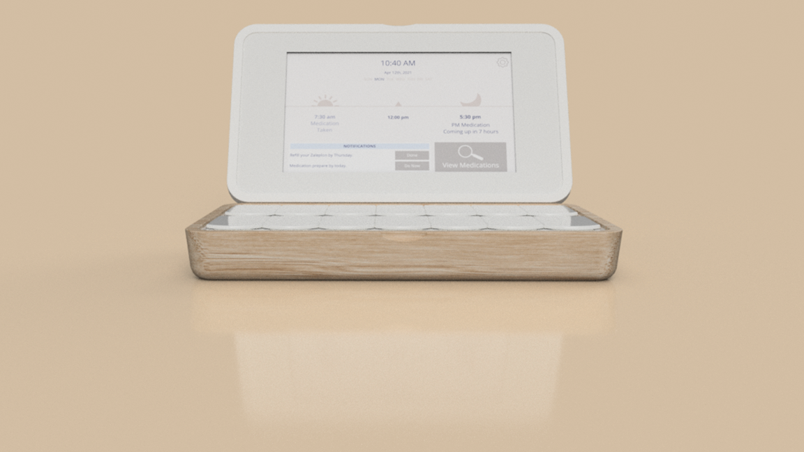
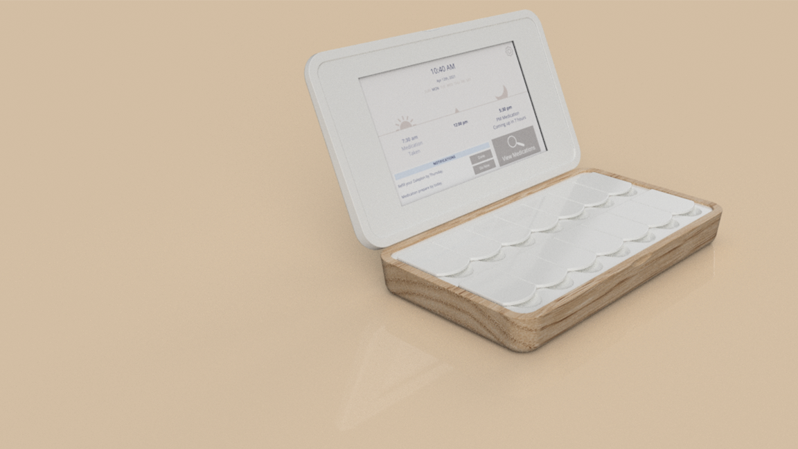
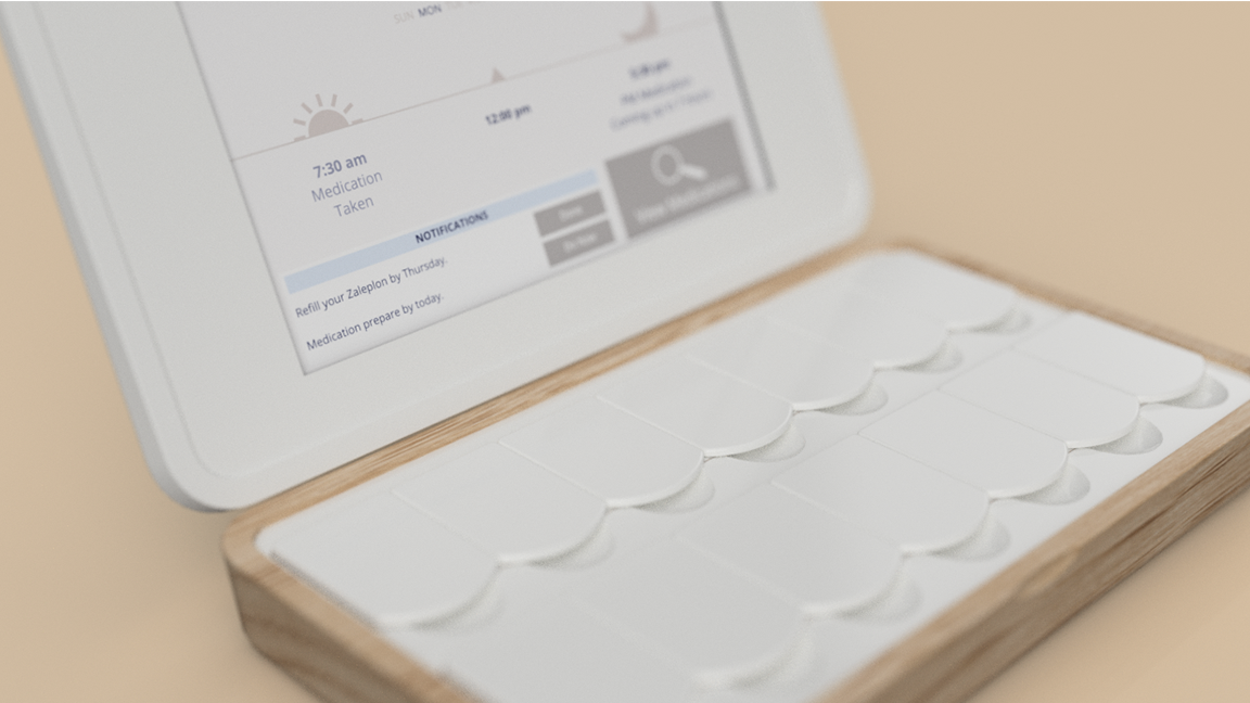
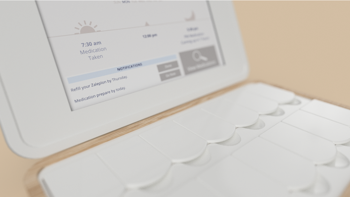
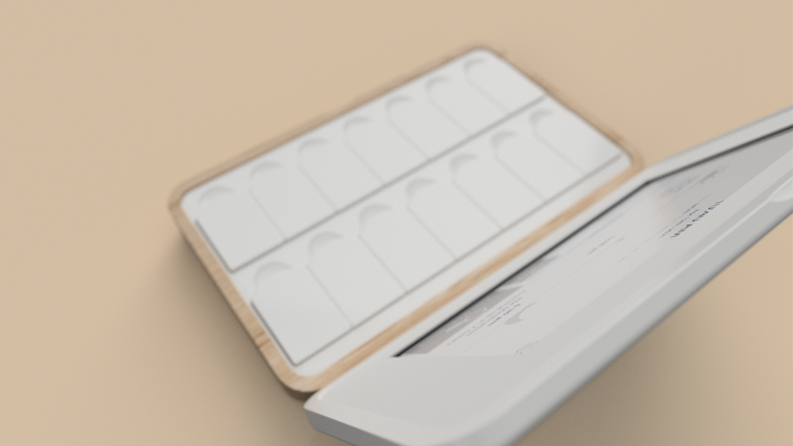
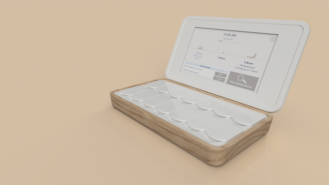
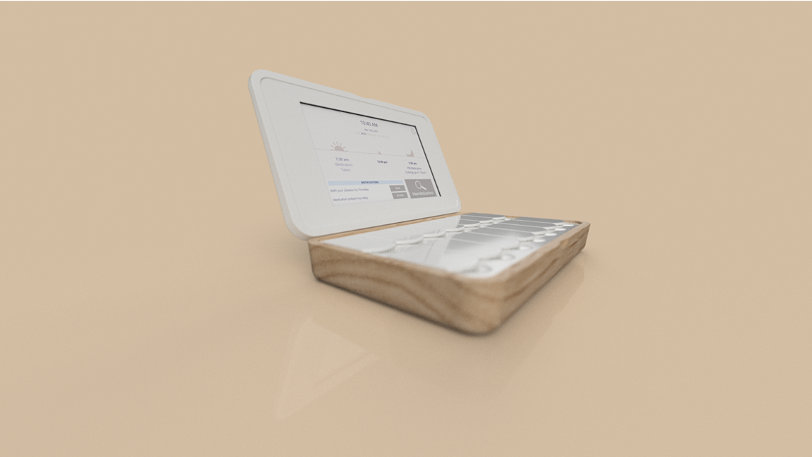
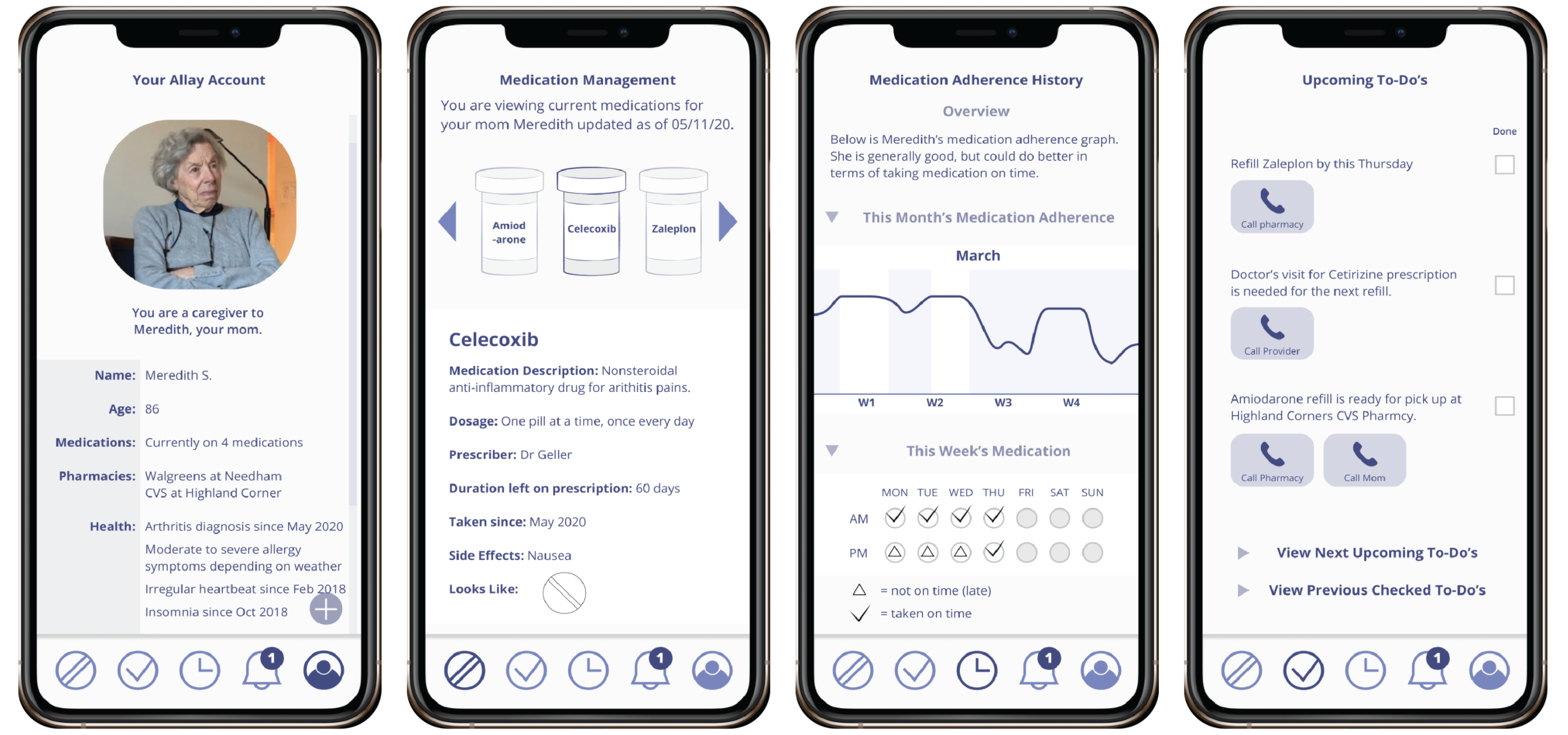
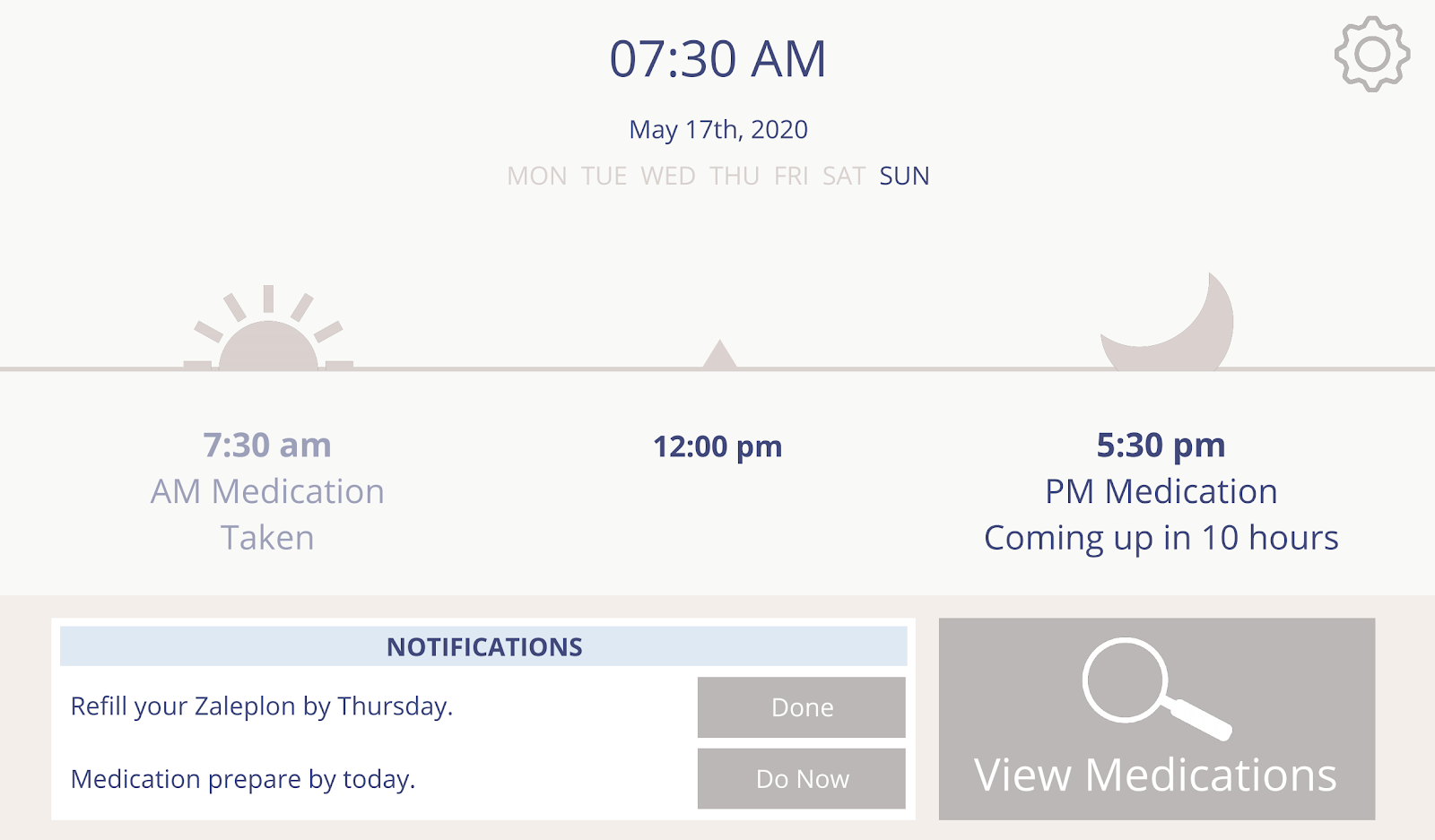
Unfortunately, around this time in the project is when we lost physical access to our users due to the COVID-19 pandemic. It would have been too slow to create physical prototypes, ship them to a single user, get feedback over video chat, ship them back, and repeat the process until we had enough feedback. Therefore we concentrated on creating digital prototypes that could convey the look, feel, feature set, and UI/UX of our concepts. Feedback sessions were held over Zoom when possible. We created a simulated user interface (hosted here) for users to explore while we took notes.

Fortunately, we found a strong qualitative and quantitative signal in our feedback data showing that we were on the right track. The level of enthusiasm among caretakers, especially, for our solution was extremely high.

Because we included business viability in the evaluation of product features and concepts, we were protected against any major surprises when it came time to generate a business model around our solution. However, there was still work to be done to build a go-to-market strategy, evaluate partnerships, ensure we had buy-in from other stakeholders, and project the financial attractiveness of the opportunity. While the numbers are certainly pro forma, you can see this work in the presentation linked in the previous section.

The final stage of this project was to design the details of the user experience, both physical and virtual. We integrated the final feedback from our users and mentors in order to take the project to the maximum degree of polish. While time is always limited and there will always be room for improvement, we feel happy with the final product in context of the ~400 working hours that were allotted. The feedback from end users, professional and unpaid caregivers, and other stakeholders indicated that we had identified and solved real and poignant unmet needs.

UI/UX designed for the elderly, enclosure designed to look less like a medical device and more like furniture, and functionality to support healthy care management. These are the needs we designed for:

To open medication containers easily
To read & receive medication information clearly and easily
To require minimal data input from the user
To be reminded when it is time to take medication
To easily know if medication has already been taken
To know if any medications have adverse interactions
To know when to order prescription refills
To have items that are visually pleasing and integrate into home environment
To feel in control over his/her own medication management